A Guide to Making New Dungeons
Today I'm working on a dungeon and I figured I'd share some of my design process when it comes to making dungeons. I'll be citing some resources that helped me get started, too!
So, personally, I usually decide the dungeon first, and the context second. In our development Discord server, we have a whole channel just for thinking of dungeon ideas! Any time I think of something that would be cool to explore as a dungeon, I put it in that server without even thinking twice about the context. Then, later on, we can pull from that list when we're deciding where the story should go next.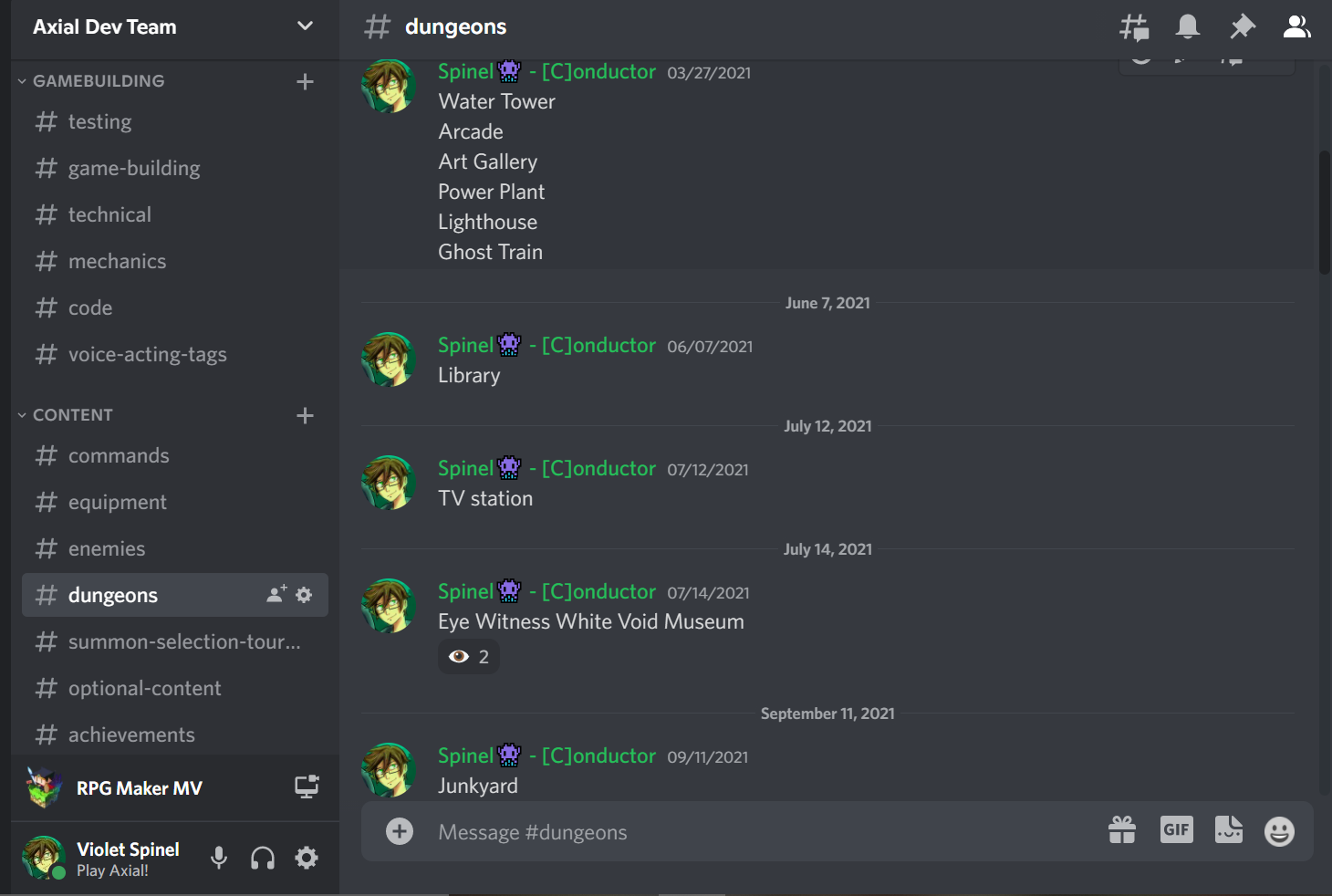
Sometimes, of course, your story naturally necessitates a particular dungeon. Obviously, you're going to be operating differently when you figure those out, but I think the process for how to design that dungeon can be similar regardless.
Alright, so, today I'm making a library dungeon. I've already gotten my story excuses down, and I won't spoil that here! However, I knew a bit ahead of time that this dungeon would be coming up around this point in the game. You can sorta predict what dungeons you might be making next simply based on what part of the game you're working on (so in this example, I already knew that the next portion of the story would be in a town where it would make sense for a library to be there).
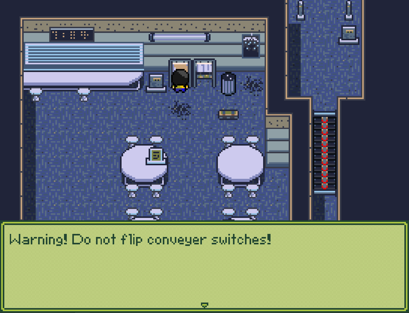
Now that we know what dungeon we're making, it's time to figure out a vibe! By "vibe", I generally mean the sort of tone you're going to evoke. The music, colour palette, and dungeon gimmick should all be dictated by the vibe of this dungeon. As an example, the Grand Central Station dungeon is intended to evoke the vibe of a run down bus station, so I went with harsh whites and blues to evoke the cheap fluorescent lighting and patterned tile that I can usually expect to see in the bus stations I've visited.
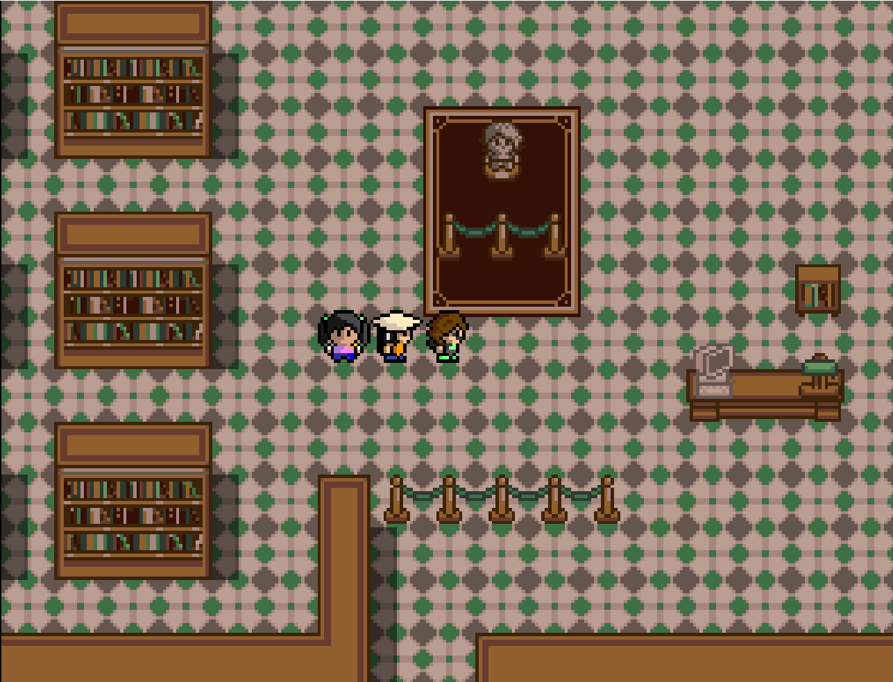
For this library dungeon, I want it to be one of those big fancy university libraries that you see in the movies. Immediately with the idea I've got, some imagery comes to mind. Spacious hallways, rows of desks, and walls of books that stretch to the sky. This imagery also helps me pick a colour scheme right away - there is gonna be a lot of brown and green here!
This is a great resource to help you get started with deciding how to approach a new tileset.
The really important factors are colour schemes, and having a clear image in your head with lots of inspiration always helps. I personally try to stay minimalistic, using as few colours as possible in order to sell the pixelated vibe. My personal rule of thumb is to start with a "base" colour and work from there, using a very dark version of that base for your outlines, and making tweaks for the various hues and shades.
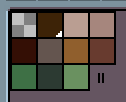
Here's a brilliant tutorial to help you pick colours for your tileset!
Once I pick out some colours to start with, I make the bare minimum: a floor, and a wall. These are the skeleton of your dungeon, after all, and every other tile and object in your dungeon is going to be contextualized by either the floor or the wall. When you get those finished off, you can start building a room to make sure it all looks good, and then it's time to start thinking about a gimmick for your dungeon!
This is a must-read article about dungeon design.
Every dungeon needs something that makes it special. My personal goal is to try to "one-up" myself with every new dungeon I make. When I've got a puzzle idea that gets me excited to show it to people, that's how I know I've made a real keeper! Dungeons don't always need to have puzzles, but I do feel that some sort of interactive element is necessary to make your dungeon special. I'll be collectively referring to those elements as "gimmicks". The word "gimmick" has a negative connotation, but I don't mean that at all: I love gimmicks, they're my favourite part of any system, and I think we should all be embracing gimmicks to make our dungeons interesting.
For the library, I start by thinking about what sort of goal you have in a library. Traditionally, the purpose of going to a library is to find a book, right? Well, now we're onto something: the gimmick for this dungeon should be about books. I know, it sounds pretty obvious, but now that we've narrowed it to that, we can get brainstorming!
A concept I've recently become interested in is dungeons with a large "hub room" that connects a lot of smaller rooms together. This can really help keep dungeons from feeling like a just set of hallways, and it makes them feel connected and part of a same whole. Some of my favourite examples are Air's Rock from Golden Sun: The Lost Age, and South Pass from Trailblazer. Since I wanted to try this concept out myself, I came up with the idea of a really big set of bookshelves that you get to weave in and out of by climbing down those ladder thingies that they have in libraries.
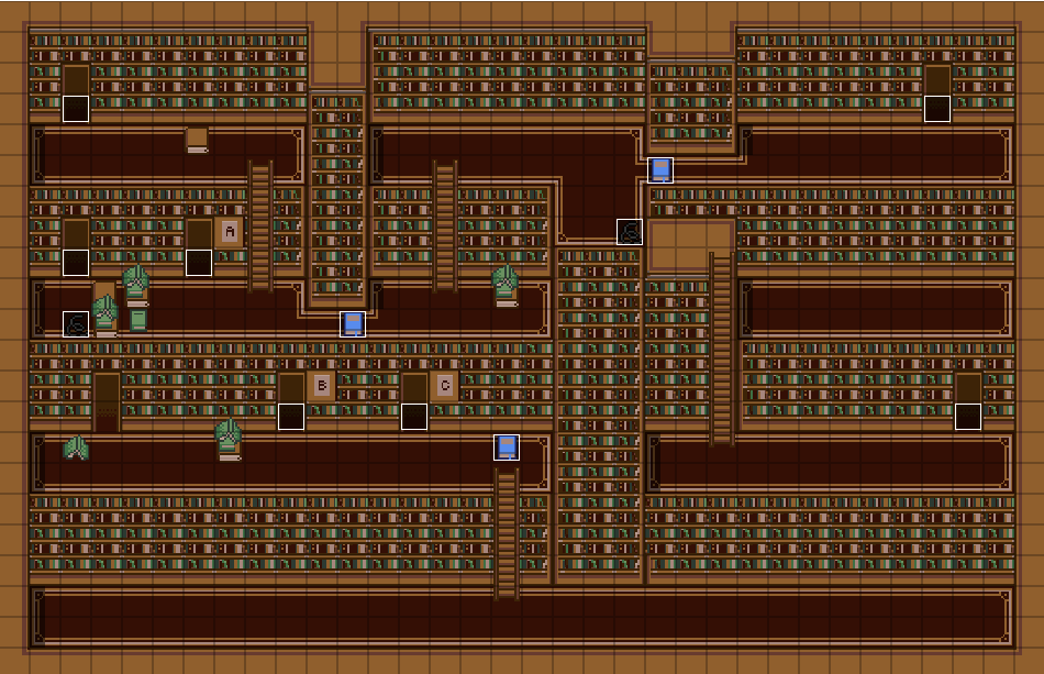
Once I made a few paths and outlined what direction the player will be moving around in this dungeon, the idea for the gimmick finally came to me: you need to find books, and put them in the right place. I think part of me was inspired by Hollow Bastion from Kingdom Hearts for that idea, since there is a similar mechanic in that game where placing the correct books on the shelves moves around the bookshelves to help you progress.
Moving bookshelves sounds like a lot of work for me to design, though, so I tried thinking of other methods to set this dungeon gimmick up. The answer I came to is a little silly, but rather intuitive: there are books blocking your path as you progress, and all you have to do to proceed is pick the book up. But here's the kicker: you can only carry one book at a time, and you can only put that book where it belongs on the shelf (since librarians work very hard making sure their books are properly organized! Don't mess up their hard work!)
From there, I ended up making a series of small rooms, labelled with letters, and each book tells you the name of the author! After programming the gimmick, it then became a matter of constructing interesting and intuitive puzzles that revolve around the concept. Maybe there are multiple books, and you need to place them in the right order?

Now it's just a matter of mapping out the dungeon, adding enemies and flavour text, and then finally deploying for testing! There's only so much foresight you can have, so it's hard to figure out the pacing of a dungeon, but I feel that ideally, a gimmick should not be presented with the same context twice: if the first puzzle is just putting this book on Shelf A, then the next puzzle needs to involve something more than just putting one book on a single shelf.
Well, that's all I have for now! If you ever want to talk about dungeon design in more detail, I highly recommend checking out the RPG Maker Beta Tester Discord! We have discussions on RPG design in there on a near daily basis!
Get Axial Disc 2
Axial Disc 2
That's the way it is.
| Status | Released |
| Author | Sawyer Friend |
| Genre | Role Playing |
| Tags | 16-bit, 8-Bit, chiptune, Game Boy, JRPG, Pixel Art, Retro, Singleplayer, Turn-Based Combat |
More posts
- 1.1.7 (13/19/24)Dec 19, 2024
- 1.1.5 (11/30/23)Nov 30, 2023
- 1.1.0 (08/04/23)Aug 05, 2023
- Patch 1.0.5 (07/25/23)Jul 25, 2023
- Patch 1.0.4 (07-15-23)Jul 15, 2023
- Axial Disc 2 OST Out Now!Jul 13, 2023
- DISC 2 UPDATE 1.0.3 (07/09/23)Jul 10, 2023
- Thank YouJul 04, 2023
- Director AMA - 01/18/23Jan 18, 2023
- Director AMA in the Discord, Tuesday at 4 PM MST!Jan 16, 2023
Leave a comment
Log in with itch.io to leave a comment.