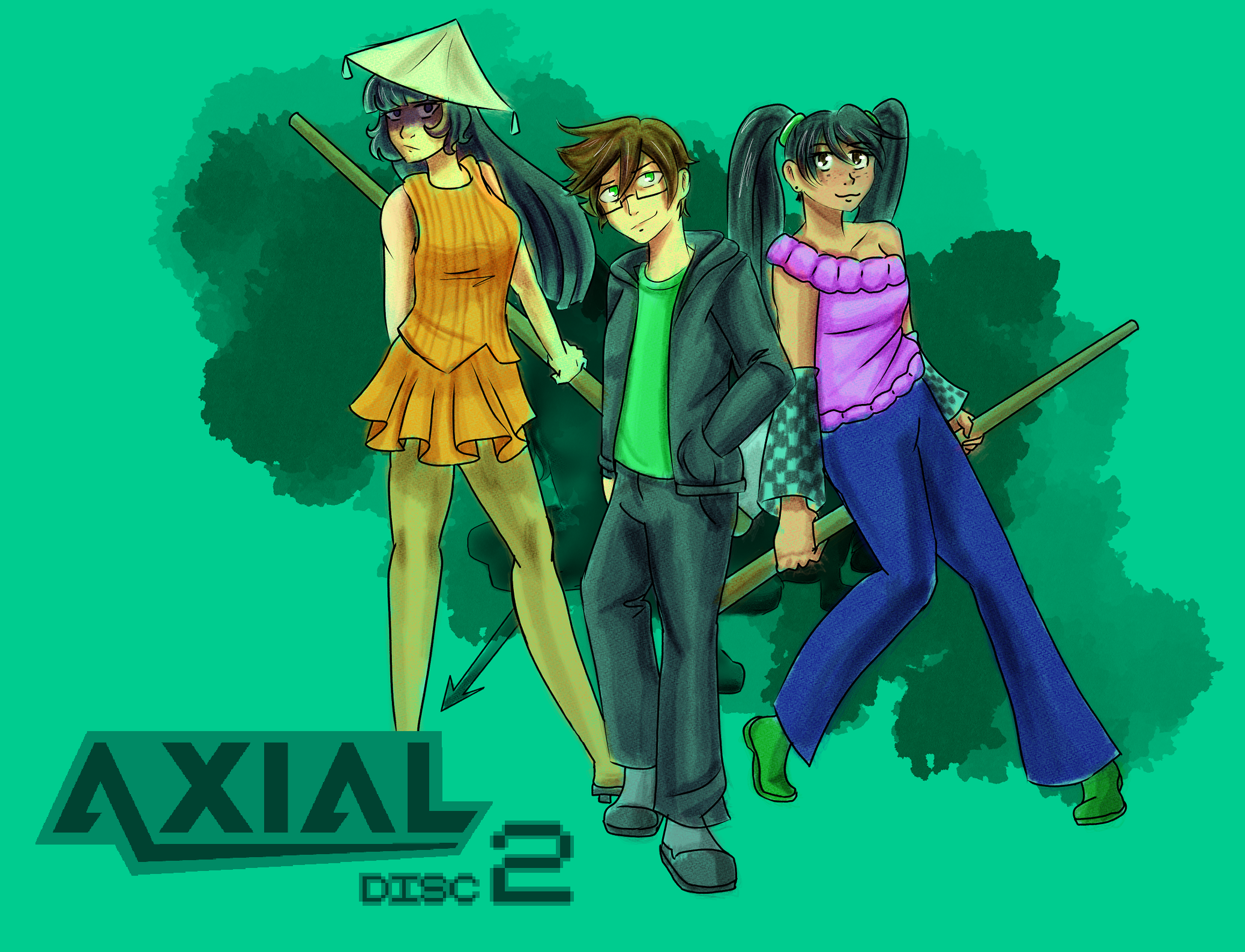
Axial Disc 2
Creating Fun Boss Designs
Now this is one of my favourite parts!
I've honestly had a pretty rough week with work not treating me very well combined with a minor crisis over what I want out of Axial. It made it difficult to work on the game, but after a sudden bout of inspiration I'm feeling back on the job!
So, that library dungeon of ours needs enemies, right? I designed a few already, but then I decided the most fun thing I could do right now to build up momentum was make the boss for this dungeon!
The idea actually came to me while I was checking through the dev server and noticed in the enemy tab, one enemy idea I came up with for this area was "bookworm."
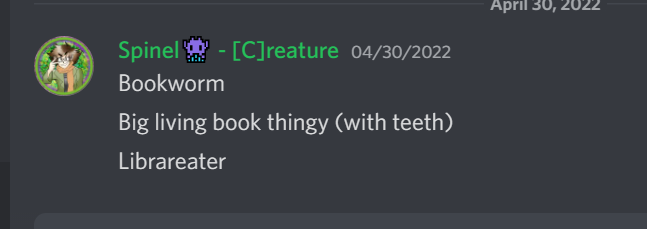
"Bookworm!" What a novel idea! This has never been thought of before, ever!
So obviously the concept of a "book worm" works perfect for me. Worms are weird squiggly lil' things, just like Eaters are in Axial! And honestly when I'm drawing Winklemo-esque monsters, I almost always default to giving them worm-like tendencies. So, in the shower, I thought of ways that I could evoke the concept of a "Bookworm" for a typical enemy.
Honestly, the ideas I came up with were sorta fun, but one idea was really getting to me, which was the idea of this MASSIVE gross fleshy worm monster popping its head through a giant book. It felt very Final Fantasy to me, imagining all the gross details and contours on this creature taking up half the screen.
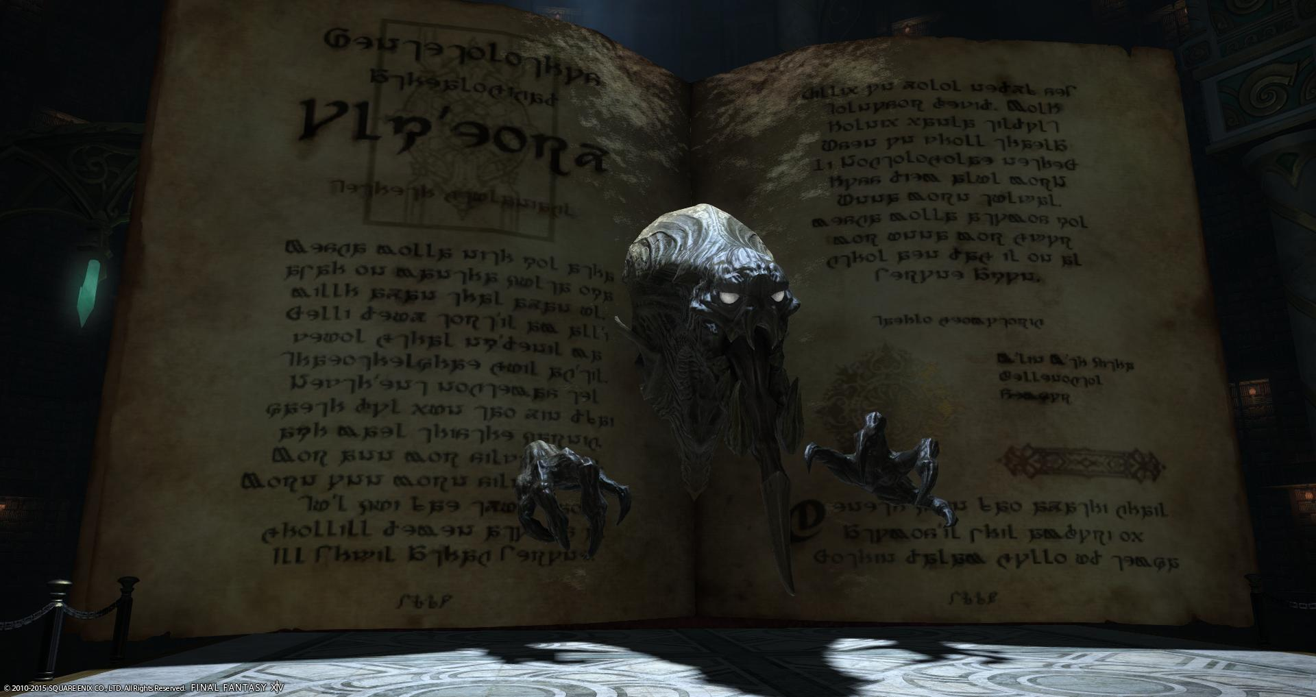
Right off the bat, I pretty much immediately started thinking about the Demon Tome from Final Fantasy XIV.
Don't get me wrong, this was a fantastic idea, but I already knew from that point that this thing needed to be a boss, which was good because for plot reasons, I needed the boss in this area to be an Eater, but I also wanted it to fit the theme of the dungeon. So, after thinking some more about what a "Book worm" would entail, a brilliant idea came to mind. You guys are gonna flip it's so freaking cool omfg
Book... Wyrm
SEE, SEE, IT'S A PUN! But putting aside my childish giddiness, this idea made me spring right out of the shower to get to work. Inspiration can come at the worst of times, but I'm glad this came to me at a time where I was able to drop what I was doing.
So, the book wyrm. Obviously it's a dragon of sorts... but we need it to be an Eater too, and it needs to have a book motif. Immediately the concept of "paper wings" came to mind, which seemed like a natural fit, so from there I got to work figuring out a general shape for the Bookwyrm.
Weird fun fact! A lot of people on the internet are really particular about the words you use for dragon-like creatures. Dragons have four legs and wings, Drakes are dragons with no wings, Wyverns have legs and wings but no arms, and Wyrms have no arms or legs but they do have wings! Well, anyway, because I do not care about the semantics of creatures that don't exist, I got Wyverns and Wyrms confused, and honestly I thought I was real clever while writing this and I was about to point out how the legs-but-no-arms thing fits really well with the aesthetic of Eaters but it ends up the pun-monster is supposed to have no legs and I gave it legs anyway, but we're getting ahead of ourselves.
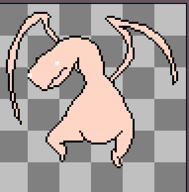
I knew it was a dragon-like Eater, so I started with the general shape. To keep the worm motif, I started with a very long scraggly neck.
Once I drew the neck, I realized this guy was gonna be really big. I started with 32x32 but quickly expanded to 48x48. The body wouldn't fit on that, so I went again to 64x64 and the whole thing finally fit... except for a few pixels on the legs. I knew I would need to go bigger for the wings anyway, so finally we settled on 96x96 for the resolution on this fella!
A quality that Wyrms Wyverns have is their distinct shape. Huge spread out wings, bird like talons pointing straight down. They look like a swooping hawk, but their posing seems to stay like that even when they're flapping stationary, so I thought that sort of effect would be good to have on this boss! Wide flapping motions are also easier to animate with fewer frames.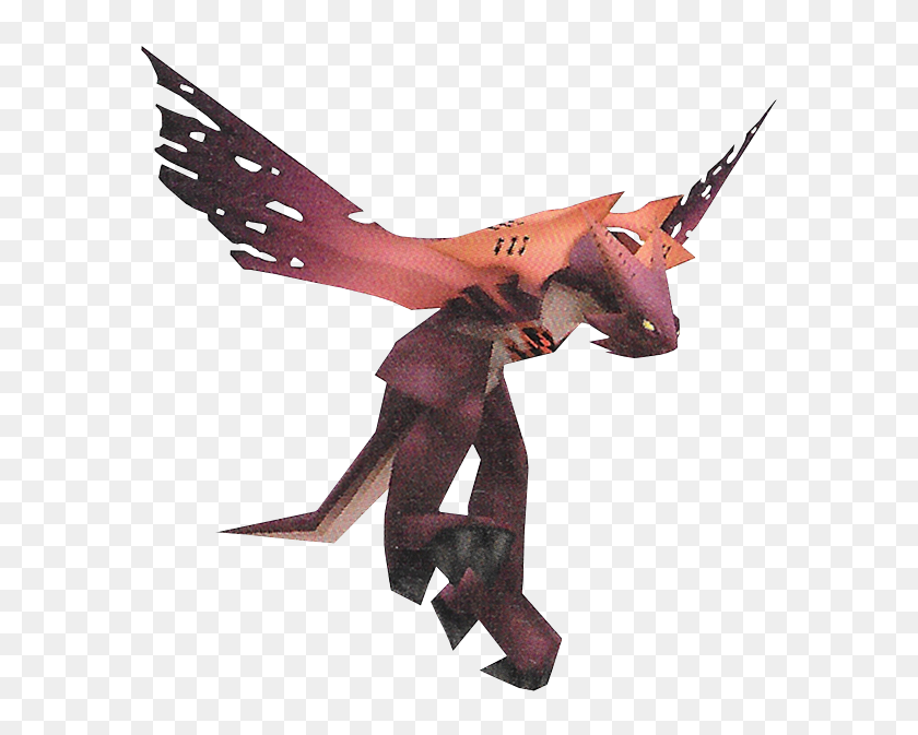
Anyone remember the Wyvern heartless from Kingdom Hearts? Wish I remembered it while I was typing that bit about dragons!
With the basic neck drawn out and a general idea for the body shape, I then started drawing the rest of the body freehand. One advantage of Eaters being so blobby is that I'm allowed to give them mismatched curves and jaggy edges, as it adds to their wrinkly quality. Of course, Aseprite's Pixel Perfect function helps a ton.
Side note, if you make pixel art, get Aseprite.. That's not a suggestion, it's an order.

There's something so fun about giving them those weird squiggly chicken legs.
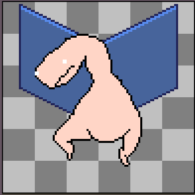
Now that this thing looks certifiably derpy as all Eaters should, it needed the wings to make it a Wyrm instead of a Worm. I wanted this creature to feel natural and like something that could exist without any weird interference, so the idea I came up with was to give it a long wing span with scale-like paper lining the flappy-part of the wing.

The idea of paper wings immediately made me think of Konan from Naruto.
In my opinion, if an idea instantly gives you a visual from something else that you like, you're probably on the right track. Obviously, you don't want to be too derivative, but I don't think Kishimoto-san would accuse my fleshy glob-monster of plagiarizing his character just because their wings are conceptually similar. So, with this visual in mind, I got to work on drawing the wing part!
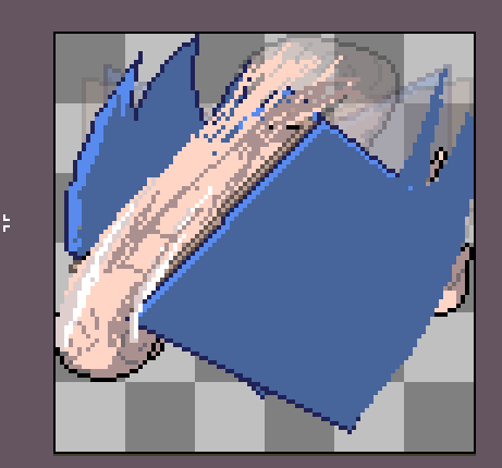
I got this far before I realized this wasn't the direction I wanted to take.
Yeaaah unfortunately, the paper concept didn't feel attached enough to the Eater, I started thinking "how did these pages get attached to this guy? Is this "book"-like enough when they're just pages?" The funny thing is that the idea I subscribed to ended up making less sense, but somehow I just like it better.
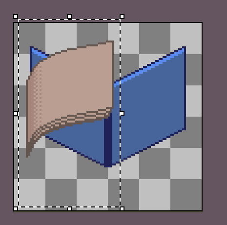
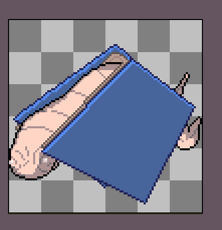
We're making the whole wingspan a big book.
So with the power of holding shift with the line tool and a mirrored line down the middle, I was able to make a pretty nice book spine for this guy's wings in a few seconds. Did I mention you should get Aseprite?
I decided to use the colour palette from the library tileset for this book to help add cohesion. From there, I turned off the fleshy body layer and got started on the paper part of the book (the part people actually care about.)
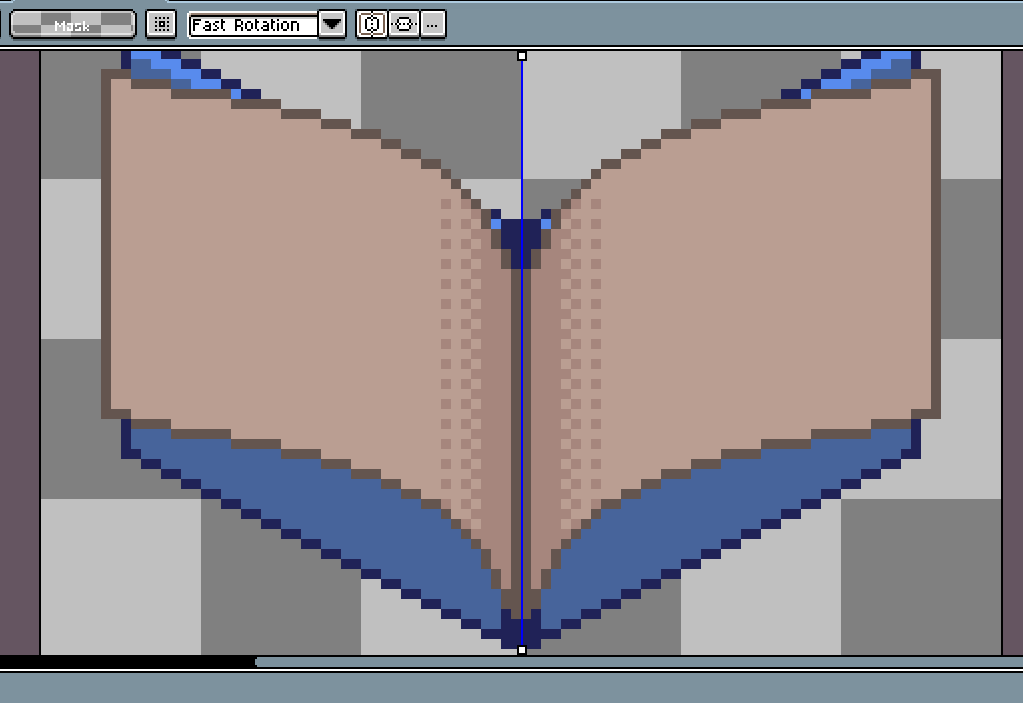
This was actually easy to make! Mirror horizontal, use the Curve tool and make two symmetrical curves that make a general page shape. Then, copy those curves to the bottom of the page, unite them with a single vertical line on either side, Fill Tool, and finally a bayer matrix pattern for the shading. I swear there's a name for that pattern, it's like the opposite of anti aliasing but I forgot what it's called...
Books have multiple pages of course, so from here I took the page and duplicated it a few times!
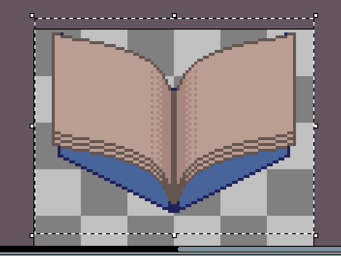
But the thing about books is that pages don't really work this way. They tend to spread out a bit, so what I did after that was copy each page "layer", and simply use the stretch tool to make the layer underneath one pixel wider than the one above, creating a staircase effect.
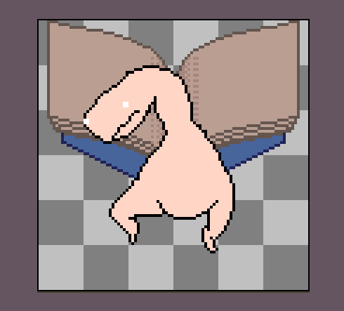
So far so good! But now that I have this creature to look at, I can imagine it flapping its wings, and right now it doesn't look very natural in my head. So, after giving it some thought, I figured out a pretty intuitive solution:
I just flipped the book upside down!
Imagine that flapping! Way more natural looking, right? We'll see for sure when I animate him, but first it's time to get the main body some detail!
same
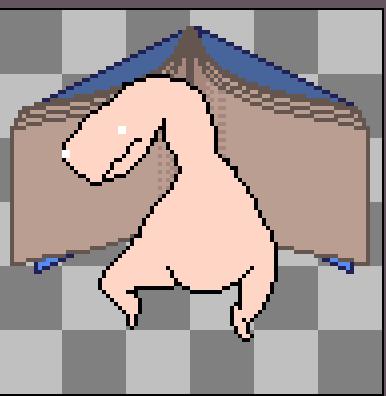
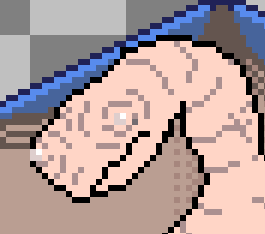
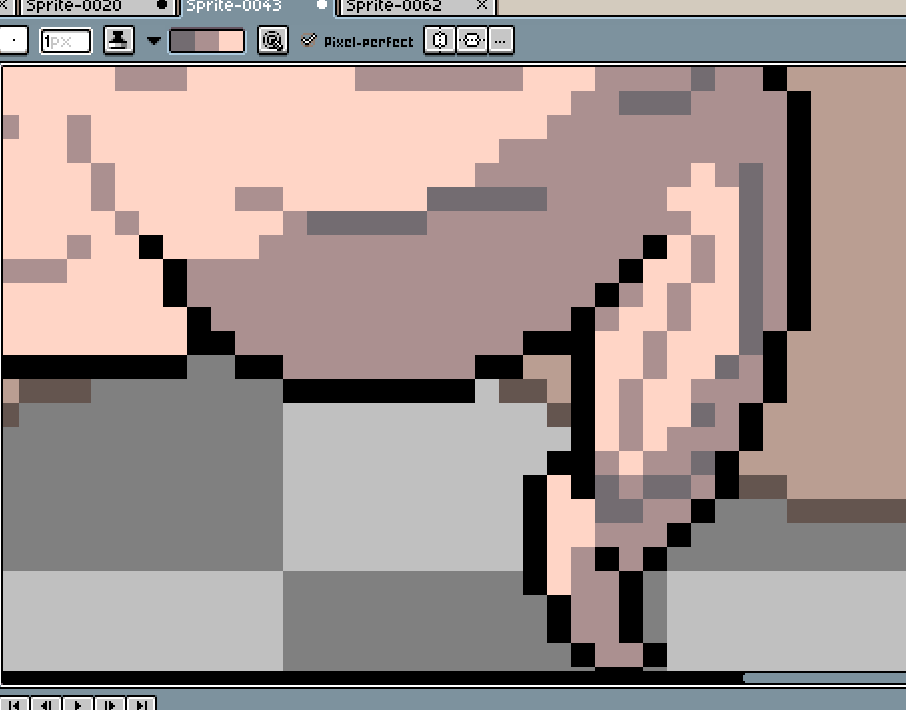
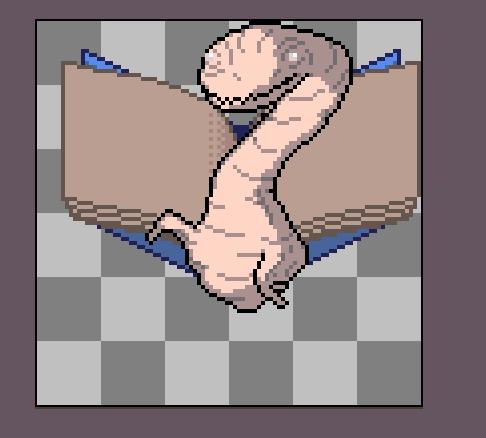
When deciding where to apply the wrinkles, I try to follow the contour of the creature. With such an abnormally large image resolution, I was able to go really nuts adding in the tiniest wrinkles I could all over its face. This not only makes it more creepy and weird, but it also looks sort of wise and aged now, which is good for this creature's theme.
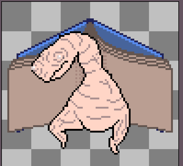
To keep the "worm" theme, I also lined the neck and body with ring-like flaps to make it more like an Earthworm.
No shading yet, because we want to save that for once it's animated. I did shade the eyes, as well as add that highlight to the book that we lost when we flipped it upside down.
Now that we've added the details, it's time to start animating it! I figured it would be easier to start with the body, since the wings will likely overlap its body. I figured with the worm concept in mind, a fun three-frame idle animation for this guy would be to have it wriggling and flailing about like a worm getting picked up, while still flapping up and down with the book wings, almost like it doesn't want to fly!
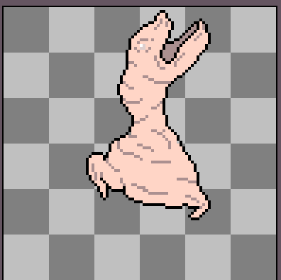
Making these creatures suffer a little brings me a twisted sense of catharsis.
I was really nervous about the book wings, and tried out a few concepts for how to approach this. The book needed to look like it was flapping its "wings" open and shut, but I couldn't shut it too hard or it'd smoosh the Eater! One concept that came to mind was possibly having the pages swing back and forth fluidly while the cover stays more rigid, so I tried doing that.
An approach I considered was to see if I could simply reverse the direction of the pages to make them "flap", but that didn't look as natural as I hoped.
Finally, while flipping back and forth between frames, I realized that a book dramatically opening and closing would actually appear to be changing from an obtuse angle to an acute angle. Which, like, duh, of course. But the interesting thing is that a *very* obtuse angle is visually indistinguishable from an acute angle. So, I realized that the solution was really easy:

I just flipped it upside down and called it a day!
The flailing really helps make this look natural, like it's just frantically swinging its arms around! I tried messing around with the pages a bit to make it look less copy-pasted, but honestly that just made it look worse, so we'll just have to deal with it.
Now it's time for shading!
Aseprite has a ton of cool features that make the shading process for overly detailed enemies like this a ton of fun. The first is palettes. I actually have a custom palette saved just for Eaters to ensure they all have that pale decaying flesh colour to them. This is further strengthened by one of my most slept-on tools during Disc 1's development: the Shading Ink.
Basically, you can define a set of colours that become a "gradient". Drawing over any of those colours with the shading ink on will replace it with the next colour down. In other words, you can shade entire swathes of detailed assets by just scribbling on them! And scribble on them we shall!
Axial has a consistent light source: the sun is always to the right of the screen, so the shadows are always on the left! This is relevant to the Bookwyrm because it means we actually apply the shadows to the right. Why? Because the image actually gets flipped once it's in battle!
Now that we have our idle animation, it's time for the attack animation!
Every enemy in Axial only has a single attack animation, so it needs to say as much as it can in the little space we have. To do this, I typically opt for a very big sweeping motion.
I only have three frames, so that means I can only do a windup, action, and follow-through!
One way that I try to be efficient with animating is adding as much motion within the frame as possible. For this guy, I put it as close to the upper edge as I could, and made it stick its back in anticipation. Can you guess what it's gonna do?
WHAM! The book closes with it as it slams right up into the target! For this frame, I threw it forward as much as humanly possible.
Now, this animation is already serviceable, actually! But obviously it doesn't have that Axial oomph. This is where the bread and butter of my animation style comes in: the smear. (No pun intended)
Pro tip: if anyone points out how scratchy your smear frames are, that means they already hated your game before they noticed it.
The Smear goes right between the windup and follow through, and is usually a distortion of those two frames combined. The purpose of the smear is to evoke a sense of speed and impact, so you basically want to create a big trail between the two frames and unite them as one. However, you also want the smear to be physically between the two frames; if it starts or ends at the same position as the windup or follow through, it will look less smooth, so I usually leave a 2-3 pixel gap between the smear and the end of the animation. Turning on your Onionskin is essential for this segment.
Once you have your enemy set up, it's time to export as a sprite sheet and viola! You should hopefully know what to do from there!
Welp, I was thinking about going over boss mechanics and whatnot too, but this one has already gone on long enough! I might return to that topic for its own blog entirely! Hopefully this helps you guys to make fun and interesting boss designs!
See you guys next week!
Leave a comment
Log in with itch.io to leave a comment.