Designing New Characters
This has actually been a topic that people requested I go over, which means I must be doing something right!

Characters are, in my opinion, the most important part about a JRPG. If the game is a sandwich, characters are the bread. Theoretically a really boring sandwich with incredible bread can still be delicious... and a perfect stack of ingredients between two great slices of bread is going to make for an amazing sandwich. No bread at all, and it's no longer a sandwich! Trust me, I know what I'm talking about, I make sandwiches for a living.
So, what is it that makes the characters in Axial allegedly great?
There is this funny thing about the characters in Axial, which is that from a perspective of sheer character design, there actually isn't a whole lot that I'm able to work with. Each character sprite, with some very rare exceptions, exists within a 16x16 square. Not just that, they all follow a very rigid template, complete with a colour palette that I am deliberately very conservative about!

These three all follow the same template, but they feel quite different, don't they?
A pretty huge part of it is figuring out what the key distinguishing features of a given character are, and honing in on those features hard. For most characters, the hair is going to be a huge defining element of who they are (in terms of design). You could literally swap out the clothes and skin tones of every character in Axial and still recognize each character based on their hair style.
Since hair is such an important element, it's pretty crucial that you think about what a character's hair means to them. Sai's hair is neat and clean; he cares a lot about being orderly and tidy. Oli's hair is curly and short, which makes her come off as a bit of a tomboy, and the soft fluffy look of it makes her seem carefree, but reliable. The curl covering one eye could also say that she's hiding something... perhaps she's a little less confident than she lets on!
Frankly, I just analyzed my characters' hair way more than I ever did while I was designing them. The truth is, I tend to go with my gut. I liked the way the spiraling contours looked for Oli, and Josh's personality felt reminiscent of a lot of flat-top-bearing characters in action films. This doesn't discredit their values though: usually, when something comes to mind that "just seems to fit" that character, it means you subconsciously already know that character better than you are logically able to describe.
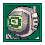
Characters aren't just their hair though!
Hair is a big thing, but there are naturally other big features you want to emphasize. Sai's glasses, Josh's moustache, Oli's scarf, these are all huge defining elements of the characters' designs that tell you a little about those characters by taking advantage of preconceived tropes the audience is likely familiar with. Whatever it is about a character that you would probably bring up first while describing their appearance verbally, that is what you want to emphasize the hardest in the design.
This also ties into colour! Colour is a massive, massive, massive aspect of character design. I can't understate that enough. There are quite a few ways you can approach colour with your designs, of course, and no single approach is going to work for every character, but the main takeaway for me is that colour is your most valuable tool when you're taking a hyper-simplified style like 16x16 sprites and using those to convey character design. I could have drawn Sai's round glasses as transparent, like they are in his official artwork, but instead they're big white circles that take up his entire face. The colour contrast against his black hair is a big element of why his glasses work on such a small sprite.
With a given character, I try to choose one "main" colour that applies to that character, first and foremost. Sometimes this is their hair colour, sometimes it's their shirt, maybe it's even just a prominent highlight, but choosing one "main" colour makes a character thematically cohesive.
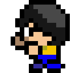
Sai's main colour is yellow, even though it's only on his shirt!
I try to use as few colours as possible for a character, which means that every new colour is highlighting something important. If you make someone with a yellow and blue striped shirt underneath a green jacket with black pants and brown hair with blue streaks, it can get to a point where the viewer won't have anything to latch onto. By minimizing the number of colours a character has, you can get a quick and easy glimpse at what this character's "deal" is.

There's this cute little art style of minimalism where you make characters out of nothing but stacks of colour. See how you can pick out who's who just from the rows of colour?
I think the funny thing about everything I've brought up about character design so far is that I've been ignoring some pretty huge elements like silhouettes and shape language. A big part of this is that in Axial's tiny art style, I'm not afforded such a luxury to give each character drastic differences in proportions or dramatic poses to make them recognizable from afar. I think those elements are extremely important to what makes a character great, but I also don't think that Axial is the place to take notes about those elements, and there are so many great resources out there from creators much better than me that already cover these topics.
Also, hot take, characters with extremely exaggerated proportions are interesting in a vacuum but fit with very few kinds of stories tonally, and even feel kinda samey in their own way. How many times have you seen the same aesthetic on a "large square shaped fella" to emphasize shape language?
Anyway, characters are also way more than how they look. Characters are their abilities, their roles, their relationships, their stories. If you are only basing your character off their appearance, you're going to have flat and underdeveloped characters.
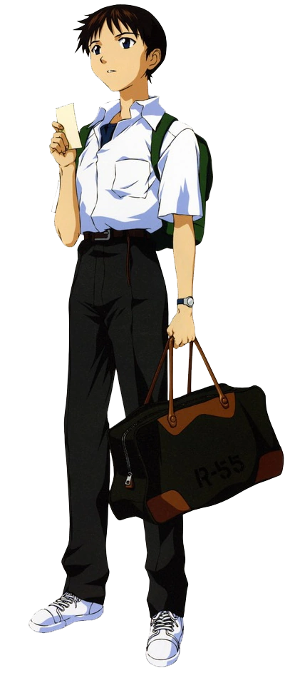
Shinji Ikari is an incredible character with one of the most generic designs I have ever seen.
I think an important thing to ask yourself when it's time to make a new character is why you are making this character. What role does this character serve that your established characters can't fill? There are a lot of ways that a character can fit into a "role". Sometimes it's a story role that can't be filled by the cast you've established, it could be a gameplay role where you need someone with a particular strength. Sometimes that role is just "wow it would be cool if I had a character who could run really fast and leave behind a trail of lasers like a lightcycle in Tron". The important thing is you need to know why you're making a new character.
From there, we can start to flesh out our characters based on that role. If it's a role they have to play in the story, you have a lot of flexibility in their personality and design, and I often use these types of characters as opportunities to experiment with different character designs. Gameplay roles are a little more rigid. They need to have abilities that fit that role, and those abilities can often shape their personality, design, and even character arc.

Roy literally started with the pun of his name being "Roy G. Biv"
For me, I like to just stick with the sort of things that appeal to me personally, that also fit the world. There's this thing I keep trying to pound into people's heads which is the fact that when you are shamelessly self indulgent, it creates a stronger vision in your art. When you create characters that appeal to your tastes, you put more effort into making them shine. If a character appeals to you, it surely appeals to someone else as well. And when your tastes fall into a similar type of aesthetic (e.g. energetic dudes that shoot lasers out of their hands), what this creates is a consistent tone between your characters. Trust me, this doesn't make your characters "samey", it makes them feel connected, like they are all a part of the same world.
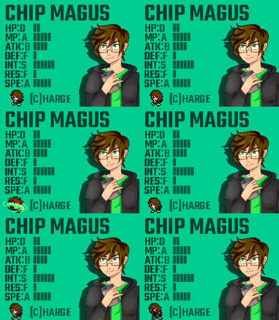
On a character like Chip, every element about him is awesome on its own but it's the full package that makes him great! That's the way it is!
Soooo yeah, I think that more or less covers my approach! This one was a little all over because I felt I needed to cover character design in a general sense and a specific sense, and I didn't even really cover the development angle that much, but I'm hoping this helps you guys feel more confident about your own characters.
Get Axial Disc 2
Axial Disc 2
That's the way it is.
| Status | Released |
| Author | Sawyer Friend |
| Genre | Role Playing |
| Tags | 16-bit, 8-Bit, chiptune, Game Boy, JRPG, Pixel Art, Retro, Singleplayer, Turn-Based Combat |
More posts
- 1.1.7 (13/19/24)Dec 19, 2024
- 1.1.5 (11/30/23)Nov 30, 2023
- 1.1.0 (08/04/23)Aug 05, 2023
- Patch 1.0.5 (07/25/23)Jul 25, 2023
- Patch 1.0.4 (07-15-23)Jul 15, 2023
- Axial Disc 2 OST Out Now!Jul 13, 2023
- DISC 2 UPDATE 1.0.3 (07/09/23)Jul 10, 2023
- Thank YouJul 04, 2023
- Director AMA - 01/18/23Jan 18, 2023
- Director AMA in the Discord, Tuesday at 4 PM MST!Jan 16, 2023
Leave a comment
Log in with itch.io to leave a comment.